


LIVING IN COLOR

At Tiptoe, we believe colour has the power to influence our daily lives. It brings warmth, energy and harmony to our interiors. More than an aesthetic choice, colour expresses personality, creates emotion and brings spaces to life.

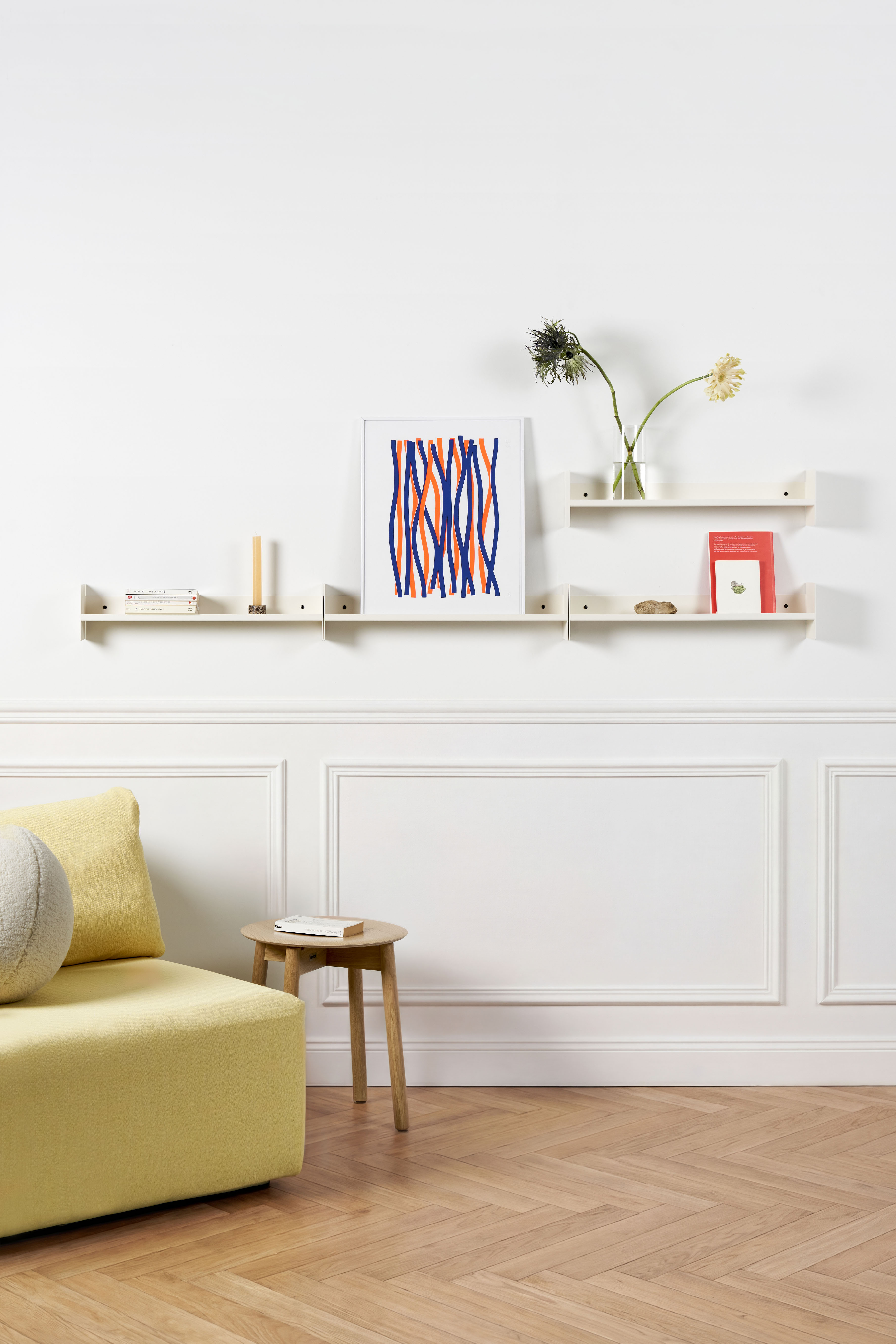
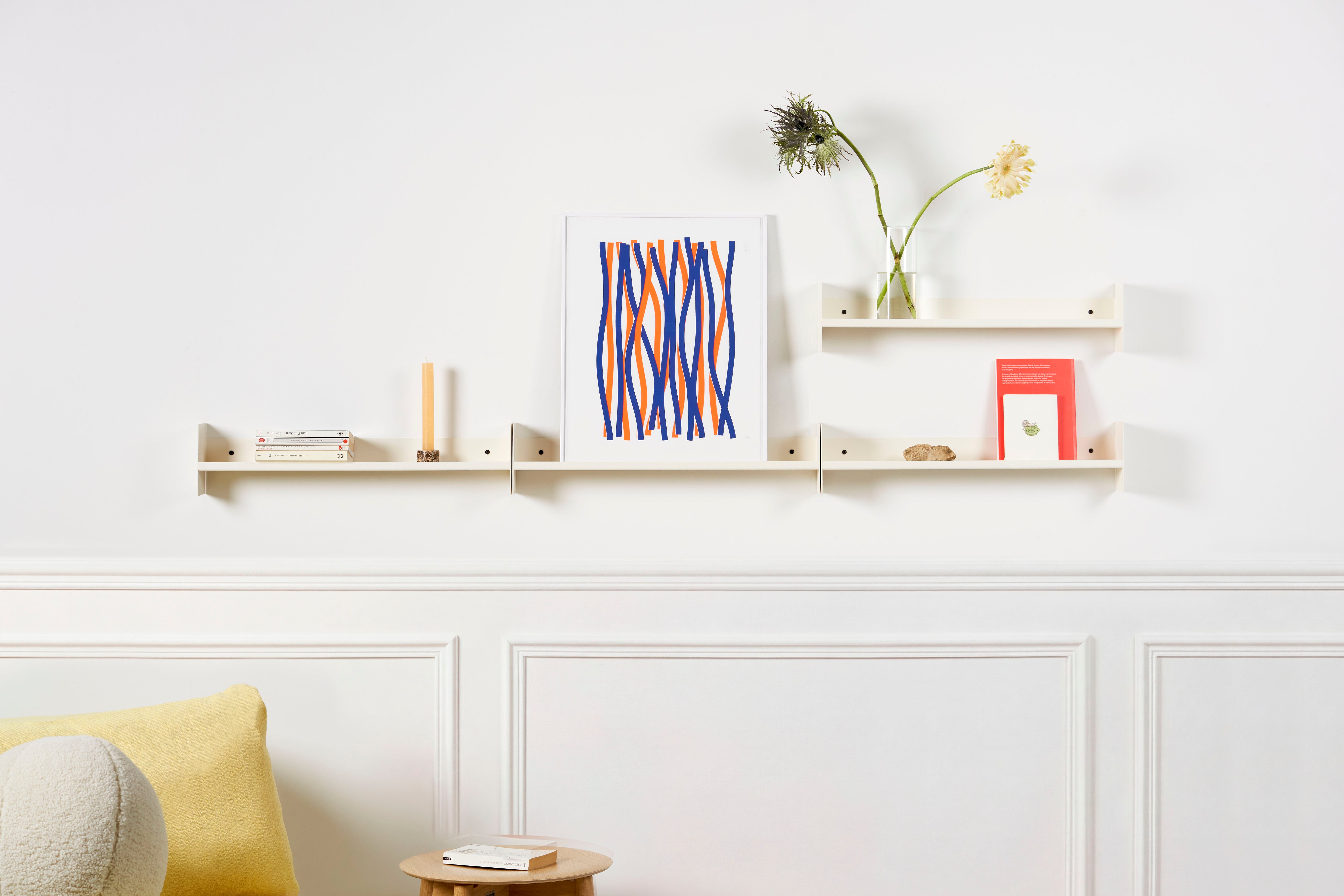
Since its creation, Tiptoe has always been driven by a passion for bringing colour into our interiors, through its timeless collections and exciting collaborations. Every piece created by the studio is designed to inspire and transform the spaces in which people live.

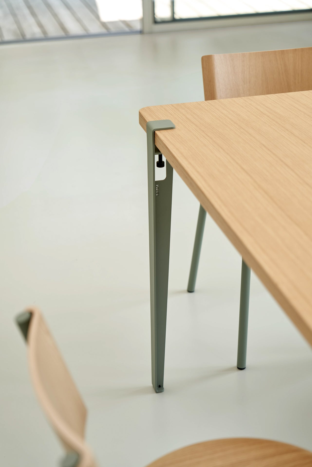
We think about how colour lives within a space, interacts with light and materials, and complements a wide variety of interiors, from the most minimalist and natural to the boldest and most eclectic.
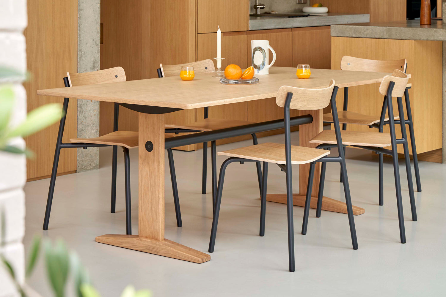
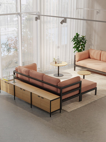
This season, the studio is delighted to unveil a carefully considered new colour palette. These new shades are an invitation to fully enjoy life at home, with colours that are bold yet balanced, expressive and timeless.


Azure Blue
Energetic & Refreshing
Vibrant and luminous, Azure Blue perfectly combines depth and freshness. Its subtle balance allows it to enhance interiors by bringing both energy and calm. Modern and refreshing, this shade adds a dynamic touch to your space without overwhelming the surroundings.


Tangerine Red
Vibrant & bold
Tangerine Red is a warm shade, between red and orange, inspired by the fruity tones of tangerine. It infuses spaces with radiant light and a touch of vitality. Both dynamic and elegant, this colour creates a bold contrast that will awaken any interior without ever overwhelming it.


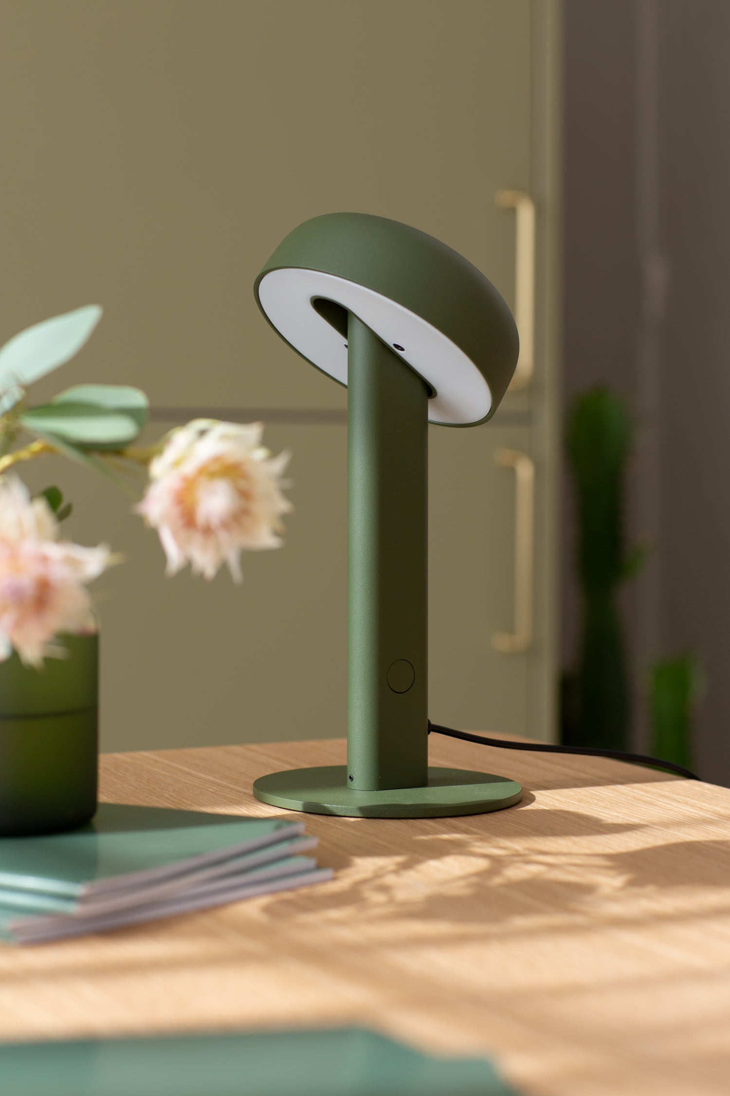
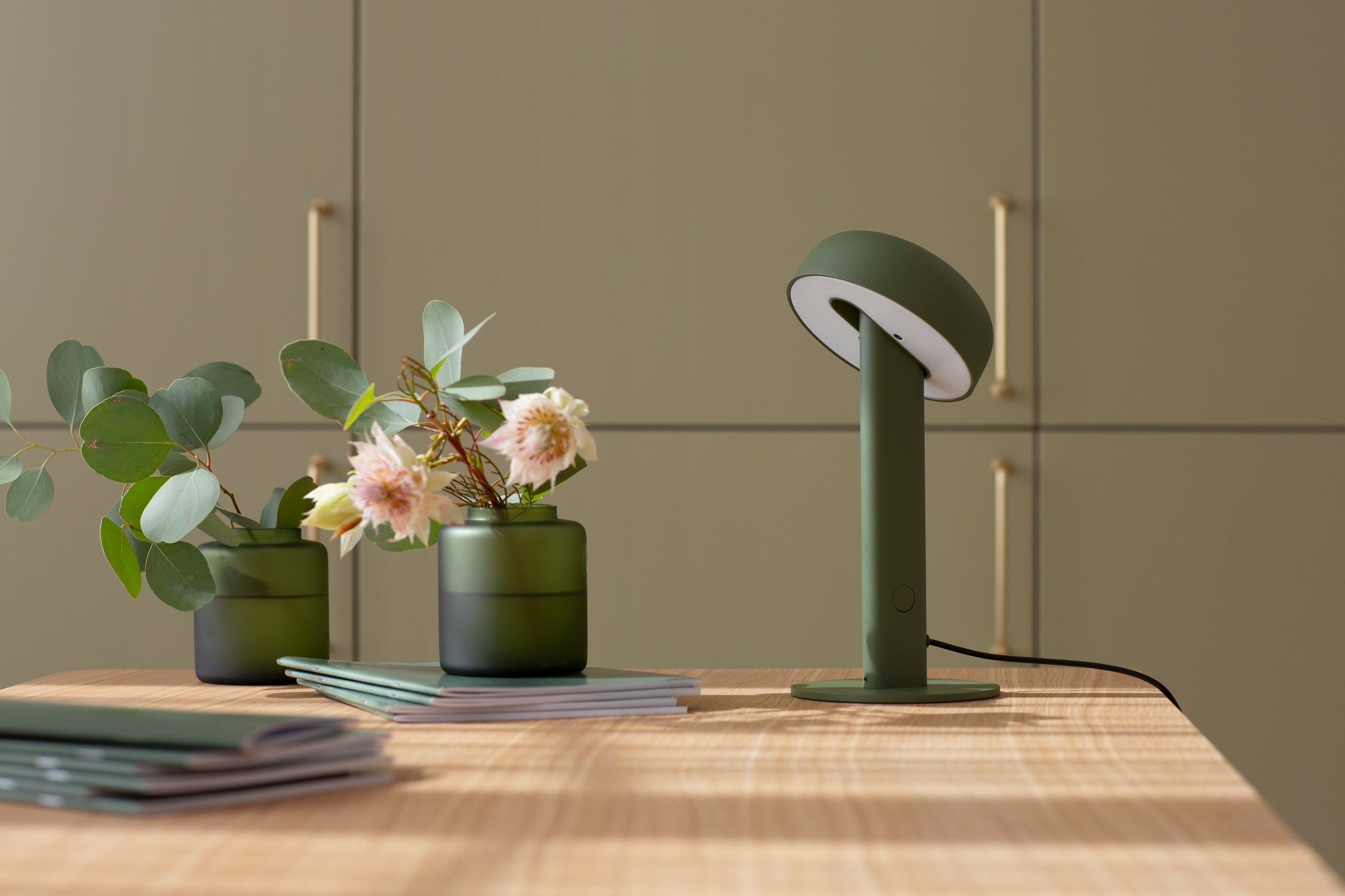
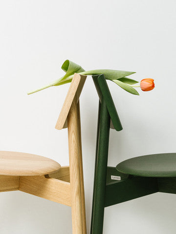
Khaki Green
Organic & balanced
Khaki Green brings an organic softness to objects, creating an atmosphere that is both soothing and timeless. Its understated yet confident tones add subtle sophistication and natural warmth. Perfectly balanced, it pairs easily with raw materials and neutral shades for a space that feels both authentic and contemporary.


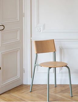
Pale Blue
Soft & subtle
Pale Blue is a soft, distinctive shade that blends fresh blue with delicate grey. Understated yet refined, it creates a calm, soothing atmosphere while adding a touch of lightness and sophistication to any space.


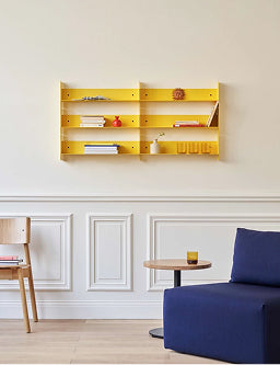
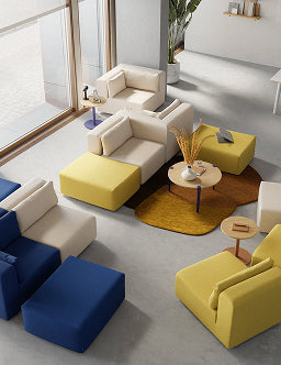
Brioche Yellow
Warm & inviting
Brioche Yellow is a warm and welcoming shade, blending subtle golden nuances. Rich in light, it brings gentle warmth to any space, creating a convivial and joyful atmosphere. Dynamic and full of softness, this colour brings a touch of modernity and energy.


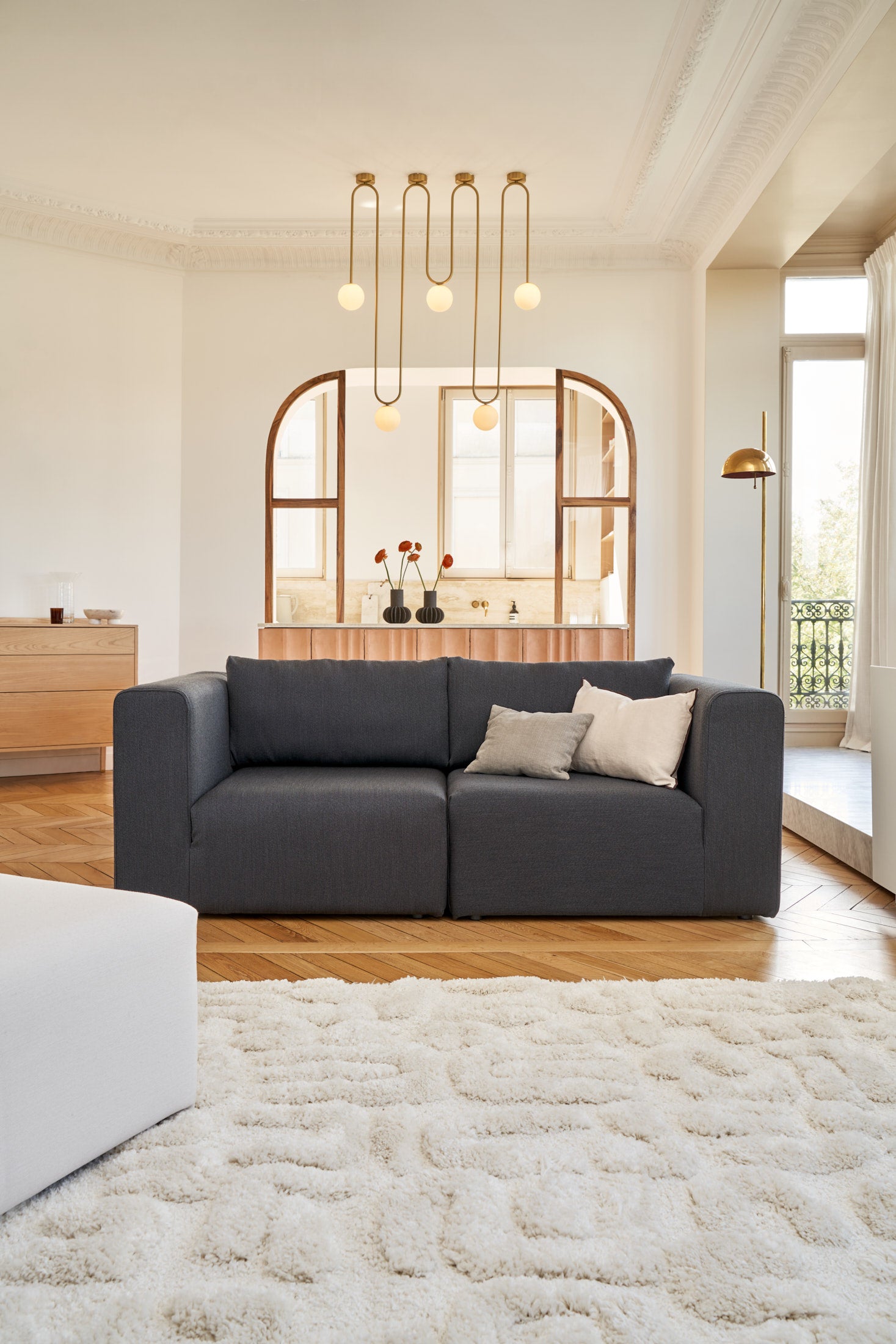
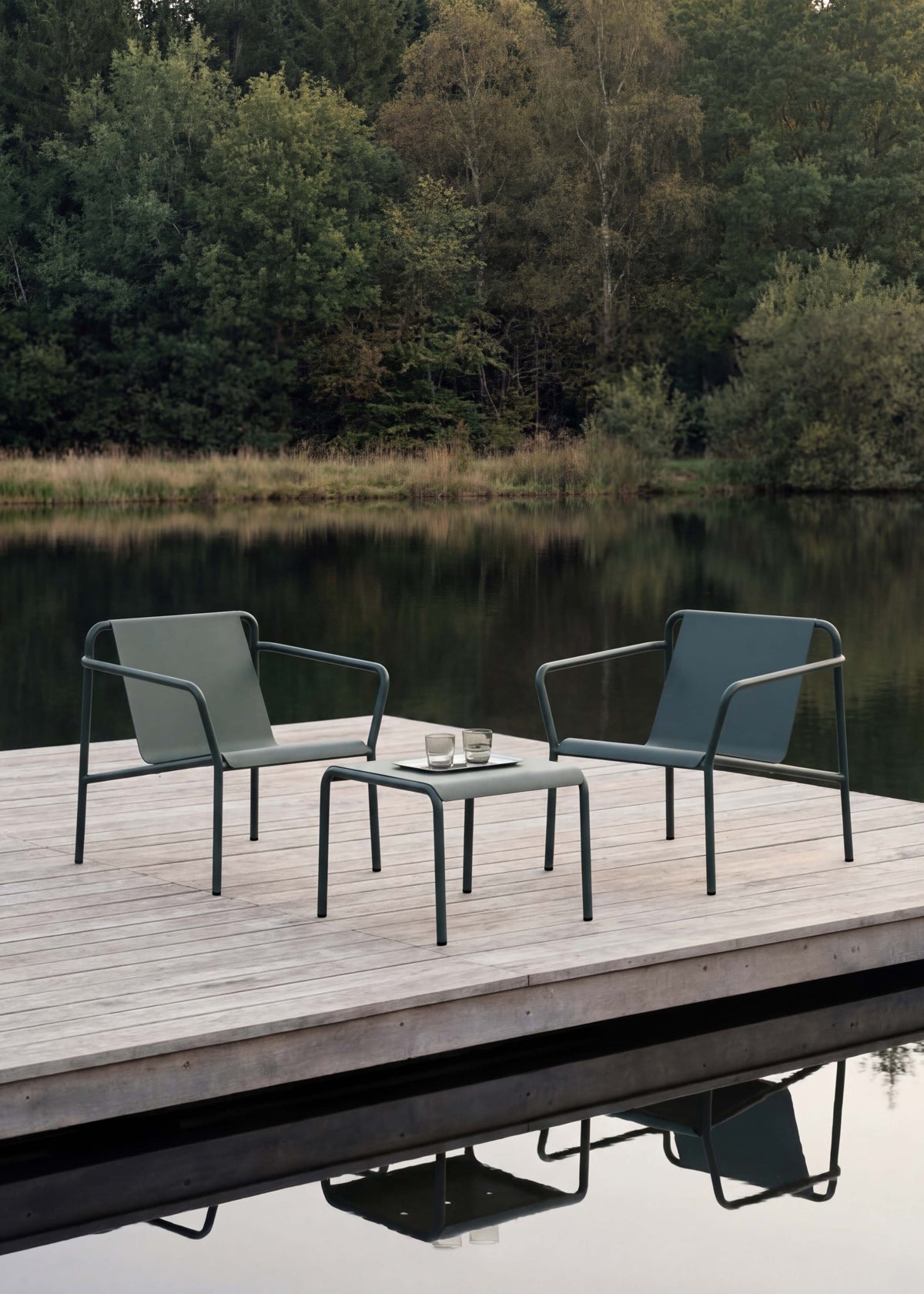
Midnight Blue
Energetic & Refreshing
Vivid and luminous, Azure Blue perfectly combines depth and freshness. Its subtle balance allows it to enhance interiors by bringing both energy and calm. Modern and refreshing, this shade adds a dynamic touch to your space without overwhelming the environment.


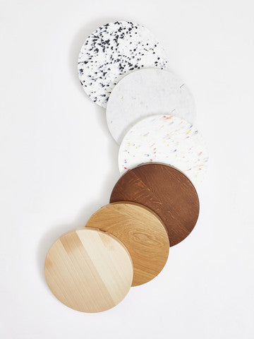
Eucalyptus grey
Iconic & Timeless
Eucalyptus grey, the studio’s iconic colour, embodies the simplicity and timeless elegance of objects. Its subtle shades between grey and green bring a discreet touch of freshness while remaining deeply sophisticated. A true Tiptoe signature, this shade pairs harmoniously with a wide range of materials and other colours, creating an atmosphere that is at once soothing


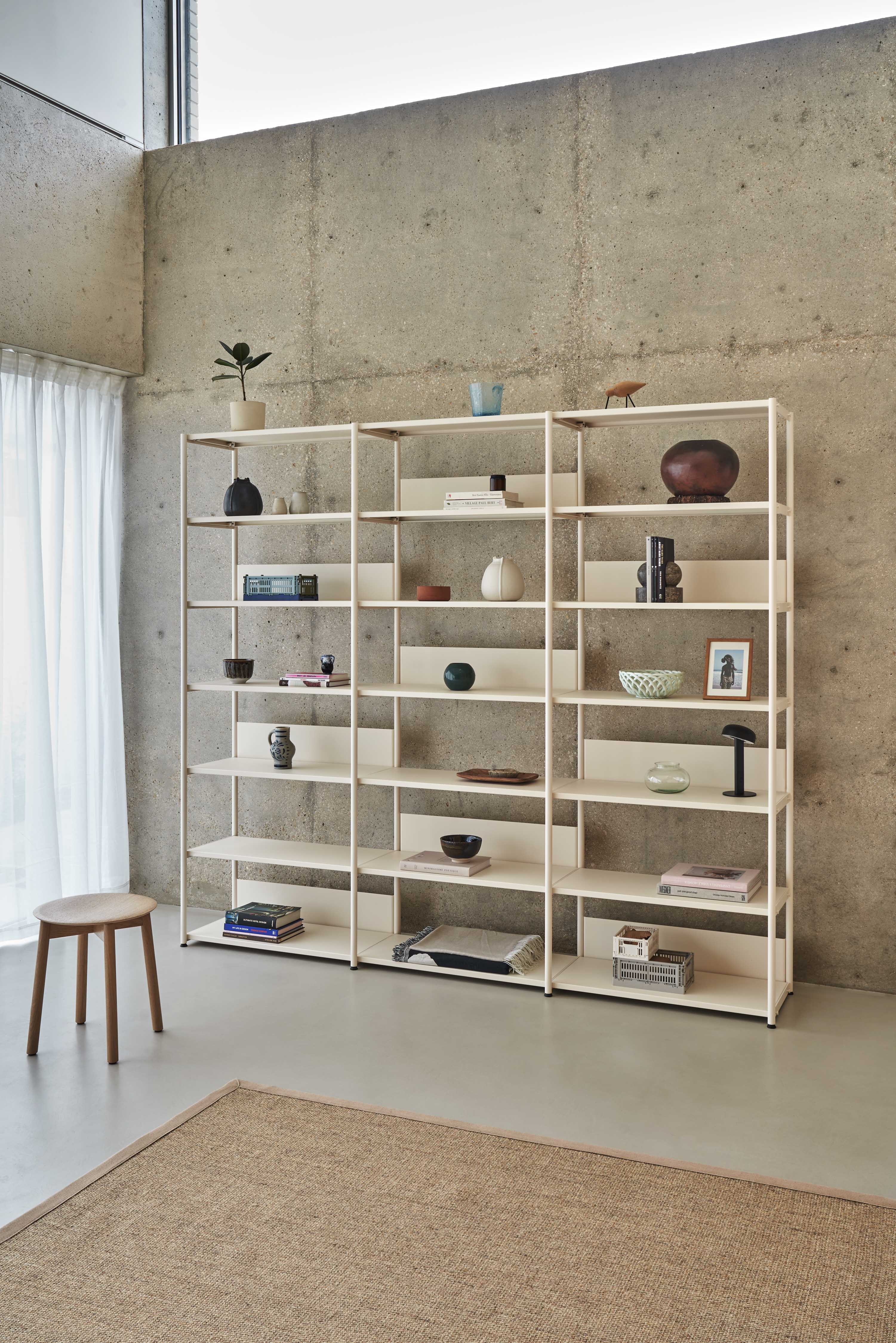
Cream White
Bright & soothing
Cream White embodies a soft, warm purity. Its light, subtle shade brings natural brightness while offering a sense of comfort and serenity. Warmer than traditional white, it stands out for its ability to create a welcoming, refined atmosphere. Perfect for enhancing noble materials or highlighting colourful accents, Cream White adds a touch of understated elegance, ideal for spaces that feel both airy and timeless.


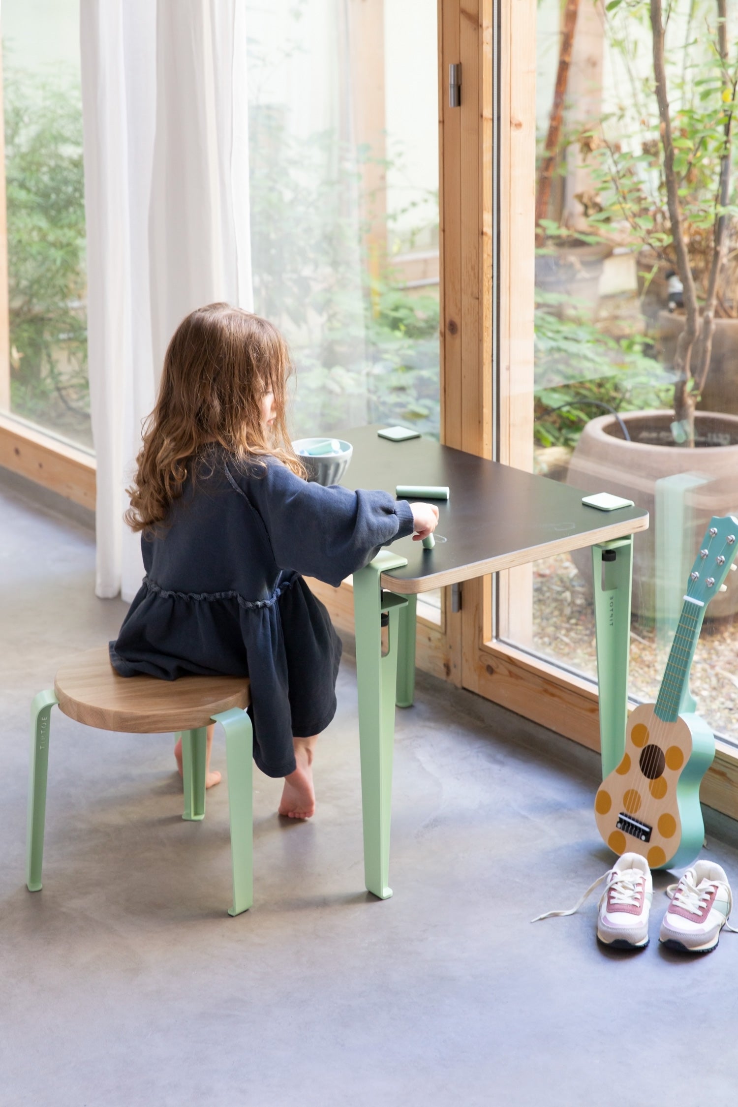
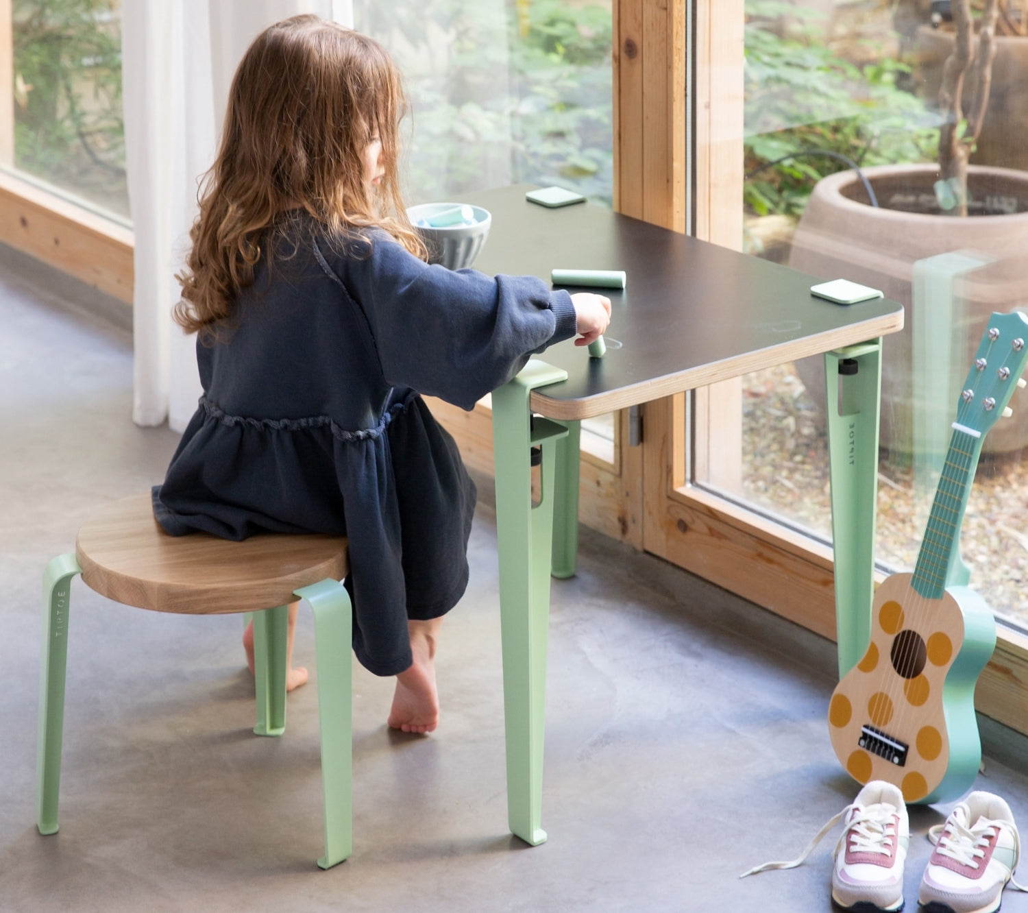
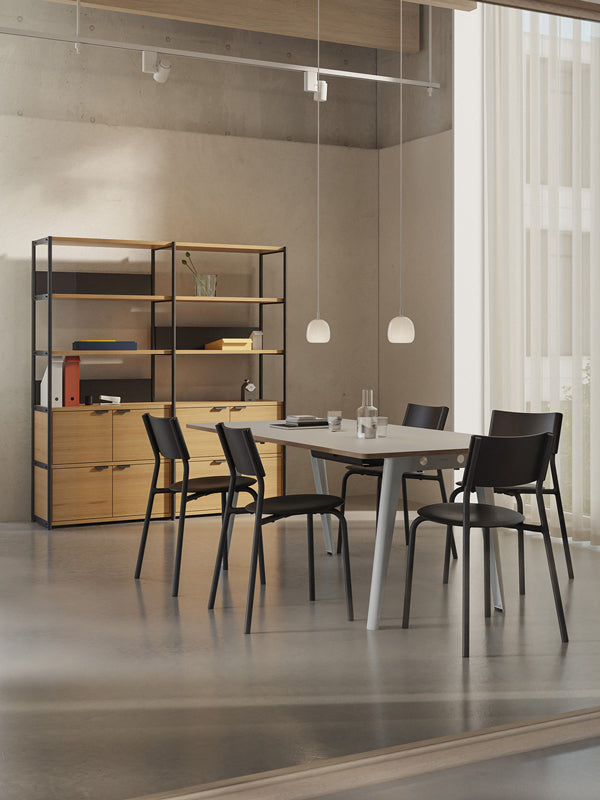
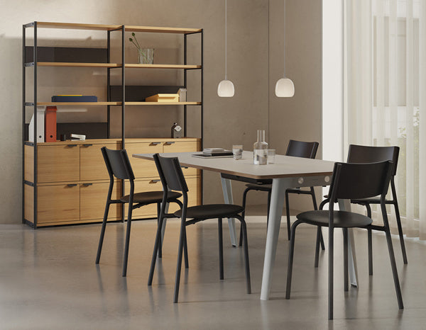
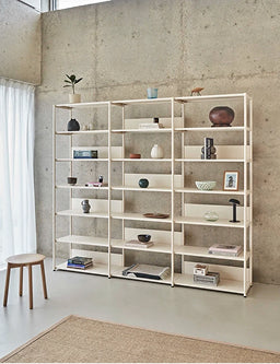
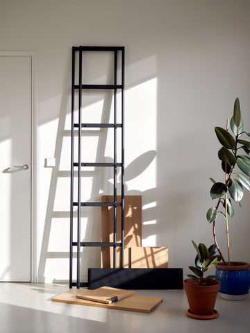
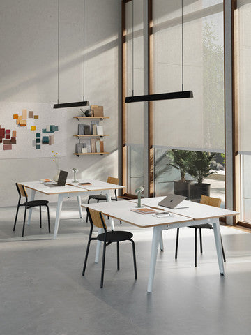
This new palette of vibrant colours comes to Tiptoe’s iconic collections.


Photographer: Jonathan Mauloubier
Set Design: Elsa Lagunas
Architecture: B2A – Barre Bouchetard Architecture
3D video: Secret swim club – Robin Barnes